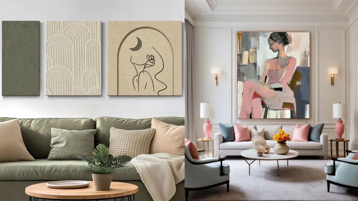
Tell me if youâve ever had this conversation with yourself:
Self: âI donât know what color to paint my walls.â
âIâll go with a neutral white or beige to play it safe,â you decide.
Self: âThen what color sofa should I get?â
âBetter be safe and get off white,â you reason.
Self: âAnd the area rug?â
âHmm, I donât want it to be too limiting, maybe a beige and gray blend,â you answer.
And this is why so many rooms are as colorless as a bowl of oatmeal.
Enter Rachel Mae Smith, color consultant, and author of The Crafted Life blog and âColorful Living: Simple ways to brighten your world through design, décor, fashion and more,â a book (Ten Speed Press, $26) due out Sept. 24.
Smithâs love affair with color started because she was the person described above, stuck in a safety palette of cream, beige and brown.
âTen years ago, I was going through a rough transition after a failed relationship,â she told me when I got her on the phone recently to talk about her new book. âI didnât have much money and thought if I furnished my apartment in neutrals, I wouldnât be wasting money on something frivolous that I secretly loved, like a hot-pink velvet sofa.â
As a result, she said, âI didnât like how my own home made me feel and I certainly didnât get anything out of being in it.â
That was then. Today her Chelsea, Mich., home, which she shares with her husband and 1-year-old daughter, is full of color and, thus, joy.
âWhen you pick colors for reasons other than happiness, it can have the counter effect,â she said. âIf you love a certain color, lean into it.â Colorful Living illustrates how buying furniture in colors you love, whether you favor pastels, woodland shades, or jewel tones, not only results in a psychological boost, but also ultimately saves money.
After taking readers through a painless review of color theory, Smithâs book shares tips on finding your favorite color, which perhaps youâve suppressed. (Hello, yellow!) It then walks you through choosing a palette for your home, and incorporating colors you love into your home and wardrobe. Here are some excerpts from our conversation:
Question: What do you wish more people knew about color?
Answer: Choosing color doesnât have to be that serious. More people should choose joyful over safe. When you mindfully choose items based on colors that make you happy, versus those that social media says you should buy, youâre more likely to love what you have longer. While choosing a hot-pink sofa or a funky patterned chair is certainly not for everyone, in the grand scheme of life, itâs a low-risk endeavor. Research shows we are more likely to hold onto bold designs longer because we crave visual stimulation. So, while a bright piece of furniture may seem shocking, it might remain in your home for longer than you think.
Where should those nervous about adding color start?
Begin by adding color to your life with small items you use often. If all you do is decide to drink your morning coffee from a mug thatâs your favorite color, thatâs a start. Then try getting a lime-green soap dispenser or an indigo doormat and see how dashes of color in high-traffic items add joy. To introduce color to a bland room, start with a rug in colors you love. Even if the room has neutral walls and furniture. Then bring color from the rug upward into the room with art, throw pillows and accent pieces, such as vases, sculptures and planters. Outdoor furniture is another place to push yourself with color. Try brightly colored outdoor rugs, pillows, tables, chairs, and umbrellas.
In your book, you talk about the economics of color. Most people think that investing in neutrals is smart and choosing color is expensive, but you flip that. Can you explain?
First, if youâre painting your walls neutral with resale in mind, you are painting your home for the next owner, not for you. You miss the point. Second, itâs not more expensive to have a colorful home. Everyone can afford color. Products are usually the same price regardless of their color. Third, putting the time into creating a cohesive color palette helps you reduce impulse buying and frivolous spending, because you shop more selectively.
While much of your book is about granting permission to break the rules, you also mention a few color rules we should follow. What are they?
Acknowledge what in your space you cannot change, such as the floor, cabinets and trim, and incorporate those colors into your palette from the start. Donât ignore existing colors because you donât like them. In fact, once you include these unfavorite colors in your palette, you can choose favorite colors that complement them and make the space feel more in sync. If your kitchen has gray linoleum floors, find colors you love that complement them.
Is there a place for neutrals?
Neutrals are colors that donât show up on a color wheel, like beige, gray, taupe, black, white, cream and brown, and they have an important place in design. In fact, they can set off featured colors. In my entryway, for example, I painted the ceiling (Sherwin Williams) Loveable Pink, the color of bubblegum, but the walls are white, and the floors are a midtone brown wood.
Whatâs your favorite color?
If I could have my whole house in pink, it just might be. My hair is pink. Itâs been pink for nine years. It works for me.
Marni Jameson is the author of seven home improvement books. Reach her at marnijameson.com.


