Just because you don’t have a huge budget to work with, doesn’t mean you have to skimp on style in your kitchen. Luckily, it’s relatively easy to create a functional yet well-designed space — no reno needed.
Take your kitchen cabinets, for example. Although there are so many styles and hardware accessories to choose from, a fresh coat of paint can be all you need to make a statement. But where to begin? To help, I asked three interior designers about their can’t-miss kitchen cabinet paint colors. The choices might vary by shade and saturation, but they all settled on rather timeless colors. Surprising? Well, not exactly.
“Generally, white and more neutral kitchens will usually feel pretty classic — especially with more traditional choices in cabinetry, hardware, and layout,” explains designer Colleen Simonds. “Kitchens are big investments, and I think most people view color as risky if you ever need to sell your home.” Read on for the top three cabinet colors that pros say are *chef’s kiss.*
If you’re looking for a paint color that can withstand the test of time, a neutral is a no-brainer. Simonds’s top choice: Railings by Farrow & Ball, a deep navy that almost acts as a softer alternative to a true black. Sure, it’s indisputably moody, but Simonds insists it’s a “classic” hue. “It doesn’t feel trendy but still isn’t white, so maybe a little less expected,” the Pittsburgh-based designer explains. “I think it really acts as a neutral and works with almost anything.”
Simonds notes Railings may be too dramatic for, say, a light, airy beach house, but this blue kitchen hue is versatile enough to complement both traditional and modern spaces. “Hardware could be nickel, chrome, brass, black, or copper,” she explains. “I could see it working with many colors of tile and also wood stains and countertops.”
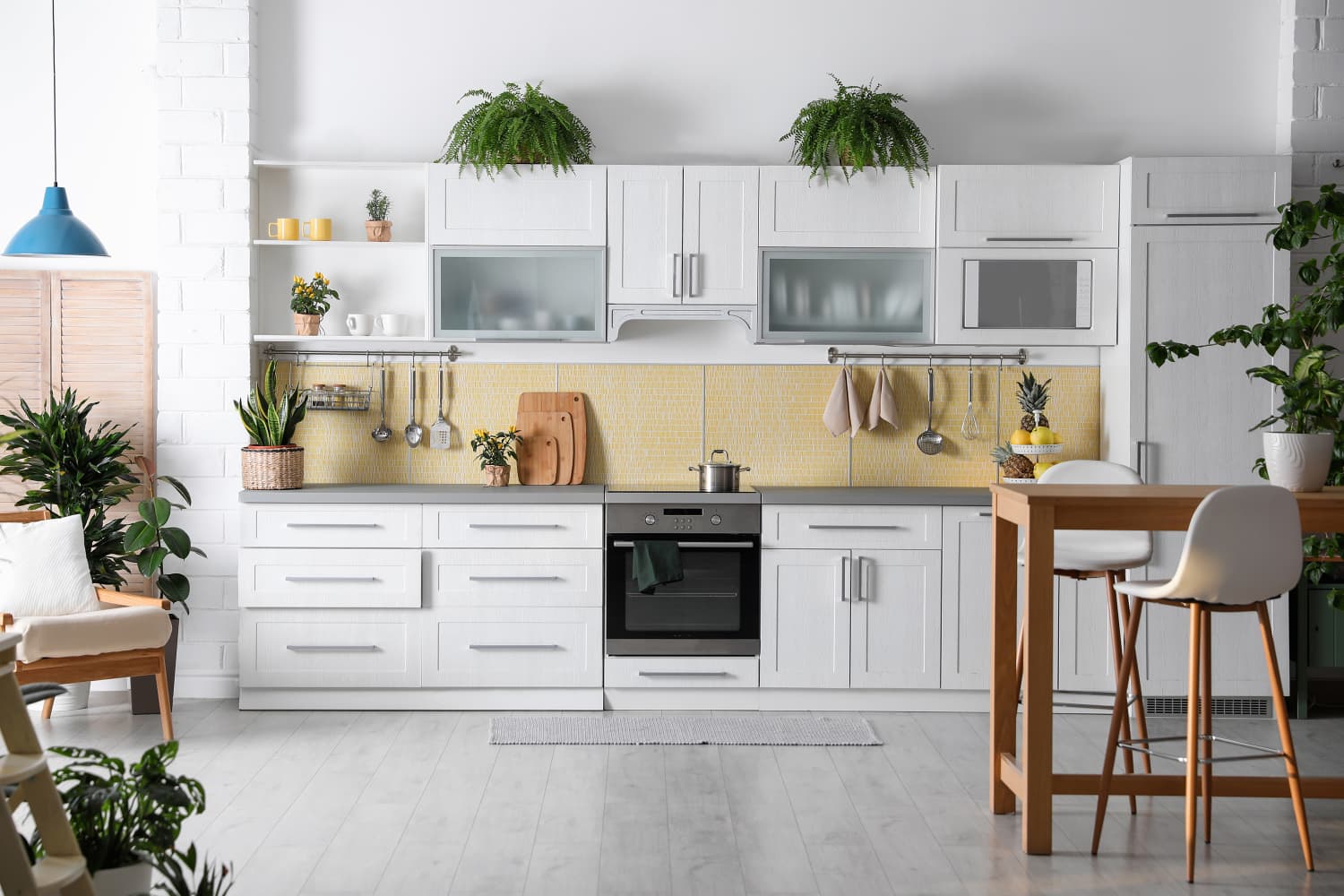
For Chicago-based designer Joy Williams, the choice is simple: Select a shade you’ll actually enjoy seeing all the time. Of course, that differs from person to person, but Williams says you can never go wrong with white cabinets. “I particularly love a fun, moody kitchen, but some would also be surprised by my practical enjoyment of an open and airy white kitchen in a small space,” she adds.
Williams recommends Pure White by Sherwin-Williams, which she says has a tendency to make a small kitchen look larger. “It can create a blank slate to show off other accessories and food items,” she explains. But just because you’re choosing a white kitchen doesn’t mean it has to feel boring — in fact, this paint offers the perfect opportunity to play with more personality. “You can pair it with a ton of darker, moodier colors for an island accent color, and the Sherwin-Williams Pure White still shines through as inviting and ‘happy,’” Williams adds.
Looking for a happy medium between crisp white and almost-black? Designer Ashley Ferguson is a big fan of Cromarty by Farrow & Ball, which she says offers more than initially meets the eye. “At first glance, you might think it’s just another neutral, but this muted gray-green has so much versatility and depth,” the Austin-based expert explains. “The color has a moody brown undertone that’s so warm and inviting yet airy and bright.”
As the ultimate “non-neutral” neutral, Ferguson says Cromarty is a color chameleon that can look good in traditional, modern, and rustic homes. “You can make Cromarty feel moody by pairing it with a smoky charcoal or a deep earthy brown, whether through wall color, stone color, or even secondary cabinetry,” she shares, adding that this design scheme works particularly well with unlacquered brass hardware. “You can also create an entirely different look by pairing Cromarty with a crisp white and polished nickel hardware for a more clean and classic look.”


