Interior designers are just regular people, who, at the end of the day, want to come home to and entertain in their own welcoming spaces. So even if you might think they’d have the trendiest, most elaborate and over-the-top homes, that’s not always the case. If you’ve ever wondered what designers wouldn’t put in their own homes, though, you’ve come to the right place. Here, I spoke with a handful of pros who each shared some common decor choices and lighting trends they’d never personally bring into their own houses or apartments. You just may find something on this list to avoid when decorating, if a designer makes a convincing argument. Or maybe you’ll continue to march to the beat of your own decorating drum. That choice is always yours to make!
1. Furniture Sets
Designers are anti-furniture sets when it comes to decorating their own homes and projects. “Things should not look matchy-matchy,” says designer Valerie Darden, founder of Brexton Cole Interiors. “Instead, your space should feel chic and collected.” She’s particularly against sets composed of brown or black leather sofas, simply because they take up so much visual space and can feel “heavy” within a room. Designer Andrea Sinkin agrees, referring to a matching bedroom or living room set as a “kiss of death.” If you have a set on your hands, don’t worry — you can break up the pieces by redistributing them throughout your home. This will help to introduce a little more visual variety in a given room.
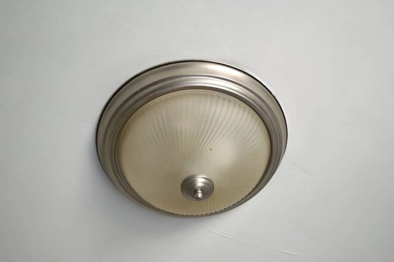
2. Boob Lights
Maybe you have one of these anatomical-looking lights in your apartment, and you just haven’t gotten around to replacing it yet. Now’s your chance, as most designers will tell you this style of builder-grade lighting reads as generic in a room and, honestly, doesn’t provide all that great of a glow either. “You can buy simple lights on Amazon or Wayfair that have more style without breaking the bank,” Sinkin says.

3. Melamine Furniture
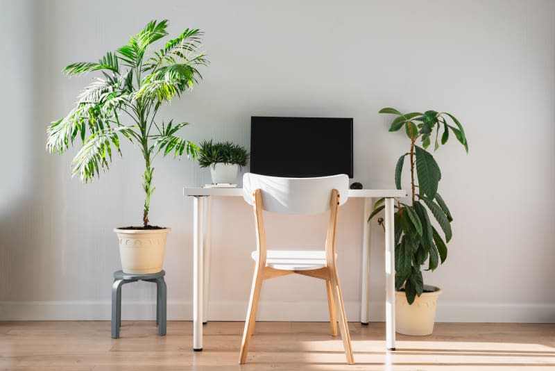
Melamine is for outdoor dishware — not furniture, at least if you’re asking designers for their professional opinion. Sinkin recommends skipping anything made from this material, as it’s not very durable, particularly when you’re furnishing your main living spaces. “You don’t have to spend a lot: Comb tag sales, Facebook Marketplace, or throw some vintage in for a timeless, effortless vibe any day over a melamine bookshelf,” Sinkin says.
4. Excessive Pillows
Yes, there’s such a thing as displaying too many pillows, according to designer Molly Machmer-Wessels of Woodland Design Company. “Of course, we love pillows where it makes sense, but pillow overkill is cluttered chaos,” she says. If you have so many throw cushions that it’s tough to find a place to sit on a sofa, bed, or chair, pare back. You can relocate them to another room or donate anything you no longer need.

5. Rugs That Are Too Small
When in doubt, go big with your rugs. “This feels like serving Champagne out of shot glasses; it’s just not right,” Machmer-Wessels says of too-small floor coverings. “I want to see an expansive, beautiful rug that fits the room.” If you’ve gone a bit too tiny in the past and now regret it, know that you can often layer a smaller patterned rug over a larger neutral one for a quick fix.
6. Generic Art That Doesn’t Spark Something
Don’t settle for low-quality, random art prints when you can find much cooler works without breaking the bank, interior stylist and content creator Kate Pearce of Kate Pearce Vintage notes. “Nothing makes a space look cheap faster than a slew of Kodak-printed art pieces hung on the wall,” she says. Instead, Pearce recommends spending a bit more effort sourcing or making more inspiring pieces. “I’ve painted my own abstractions by grabbing art from the curb, throwing some gesso over the old art, and painting over it,” she shares. “I thrift original oils and acrylics all the time, and they often cost less than $20. And if you have the money to splurge on originals from a cool local artist, your walls will thank you.”
7. Matching Frames
Speaking of art, designers definitely vary their frame choices to create the most unique gallery walls. “Some people find a great deal on a nice-looking frame and end up buying a large quantity to use throughout the entire house, and I think this is a big no-no,” says designer Alicia Hassen, founder of Brooklinteriors. “Instead, have fun playing with a variety of types of frames, whether that is more modern or vintage, metals, or woods. I even love using a variety of frame and matting sizes.”
8. Too Many Trinkets
Maximalists, cover your eyes and ears, because designers tend to keep small items and tchotchkes to a minimum. “I like a clean and simple interior — peaceful yet interesting,” says designer Audrey Sterk. This doesn’t mean you have to get rid of all of your objects, especially not the meaningful ones or family heirlooms. But a little bit of editing can translate into spending less time dusting! And who doesn’t want that?

9. Undressed Windows
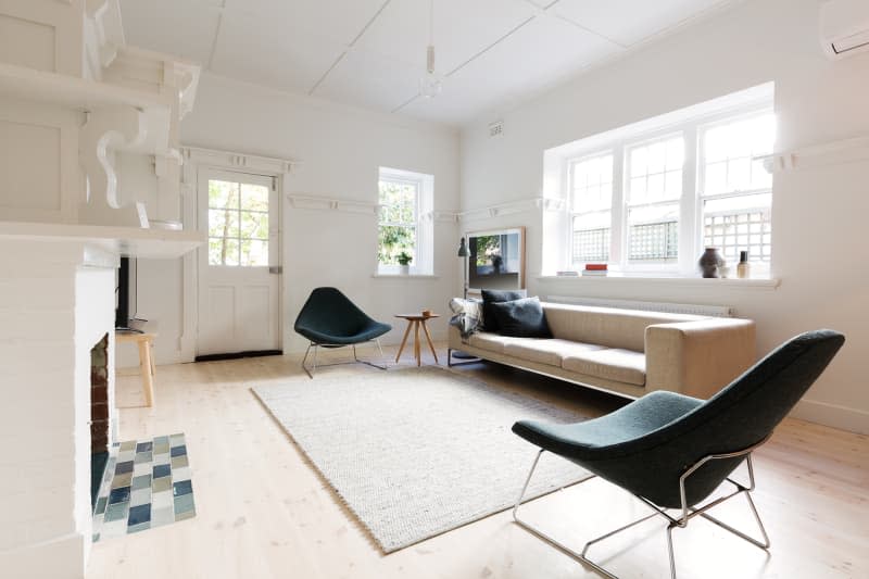
Bring on the shades, blinds, curtains. “Bare windows can leave a space feeling cold and unfinished,” says designer Sarah McCarty. “While you might not need privacy or blackout [drapes], completely neglecting window treatments is a missed opportunity to infuse personality and style. Window treatments can be a canvas for color, pattern, and texture, adding a whole new dimension to your decor.” The moral of the story? Your house isn’t fully dressed without something on the windows — unless you are trying to make your view the focal point of a room.
10. Placing Art on Every Single Wall
You don’t have to fill every empty corner, nook, and cranny with artwork. Doing so simply isn’t necessary, says designer Andrea Schumacher. “Sometimes, a blank wall can speak volumes, allowing the art on the other walls to shine brighter,” she says.
11. Ignoring Scale
Disregarding scale in a room is a major don’t, according to Schumacher. “Juxtaposing a large sofa with a small chair in a small room disrupts the delicate dance of proportion, an oversight I try to avoid whenever possible,” she says.

12. Monastic Bed Styling
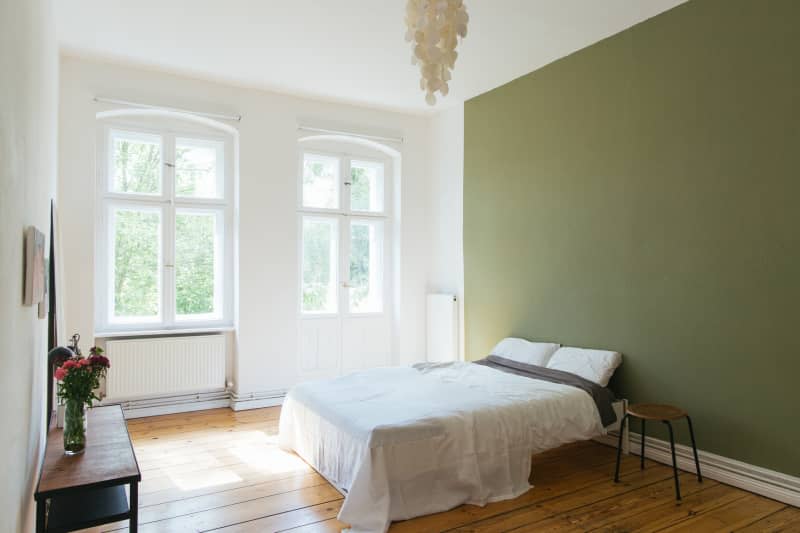
Designer Adnan Anwar calls this ultra-minimalist approach to bed styling, where you drape a single, super-thin blanket over a bed and potentially the sleeping pillows, “horrific” for how austere and uninviting it appears. “I want it to go away as soon as possible,” says Anwar. “I know beds styled that way will look dated in a few years.” While he doesn’t advise going overboard with cushions, he definitely wants to see some — at least if you want a bed to seem warm and welcoming. Maybe he sums it up best in saying, “Visible pillows and fluff call you to take a nap!”

13. All-White Everything
Go on and have a little fun with color! “While a crisp white palette can be striking and light-filled, it can also feel sterile and impersonal,” says McCarty. “A splash of color or a bold wallpaper accent wall can add personality and depth, making the space feel more inviting and unique.” But if you want a calming white-on-white scheme, that’s fine. Just use different textures to add depth and dimension to the space.


