When you buy through links on our articles, Future and its syndication partners may earn a commission.
Minimalists may feel that they have few options beyond painting their walls a stark white or in just one hue, but in reality, there are plenty of minimalist paint ideas that can elevate a scheme just as much as the right light or armchair.
We’ve spoken with interior designers and color experts on the topic, who shared with us a number of transformative paint ideas for walls, all of which still adhere to minimalist design principles. Each approach focuses on highlighting the architectural features of the room, while creating a balanced backdrop for your furniture and lighting.
Inevitably your choice of color will be a key factor to consider, but by strategically placing your paint, you can still really make the most of that small yet mighty tin of paint. From soft painterly finishes like limewash and Roman clay, alongside impactful color drenching and striking accent walls, here are some of the best minimalist paint ideas.
1. ADD INTEREST TO YOUR WALLS WITH LIMEWASH
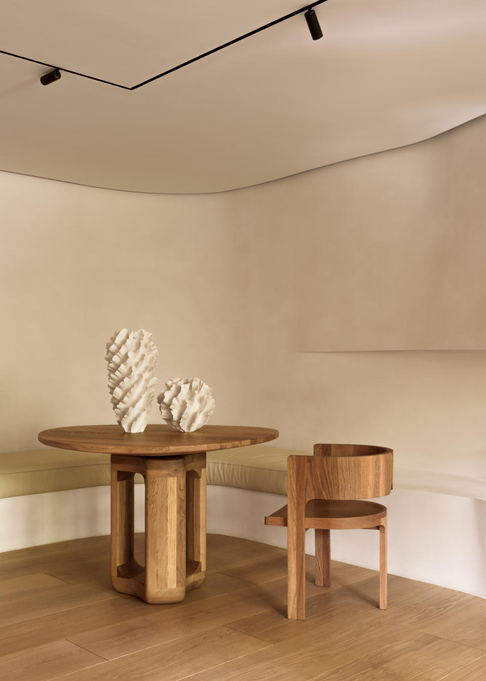

This elegant and minimal interior scheme designed by British studio Covet Noir creates a softly texture surface with its limewash walls. Although minimal in its approach, the result presents walls that retain a sense of depth.
‘When we’re working on modern architectural projects, we have to be clever in how we introduce interest, which would normally be achieved through period detailing,’ founders Maria Lindgren and Adele Lonergan explain. ‘One of our favorite techniques is using limewash paint. We love how the subtle brushstrokes of Bauwerk can add both warmth and texture to a space.’
You can, of course, consult a professional painter to see how you can recreate this effect at home, but there are also plenty of DIY limewash paint tutorials on the Internet, as the finish continues to gain popularity.
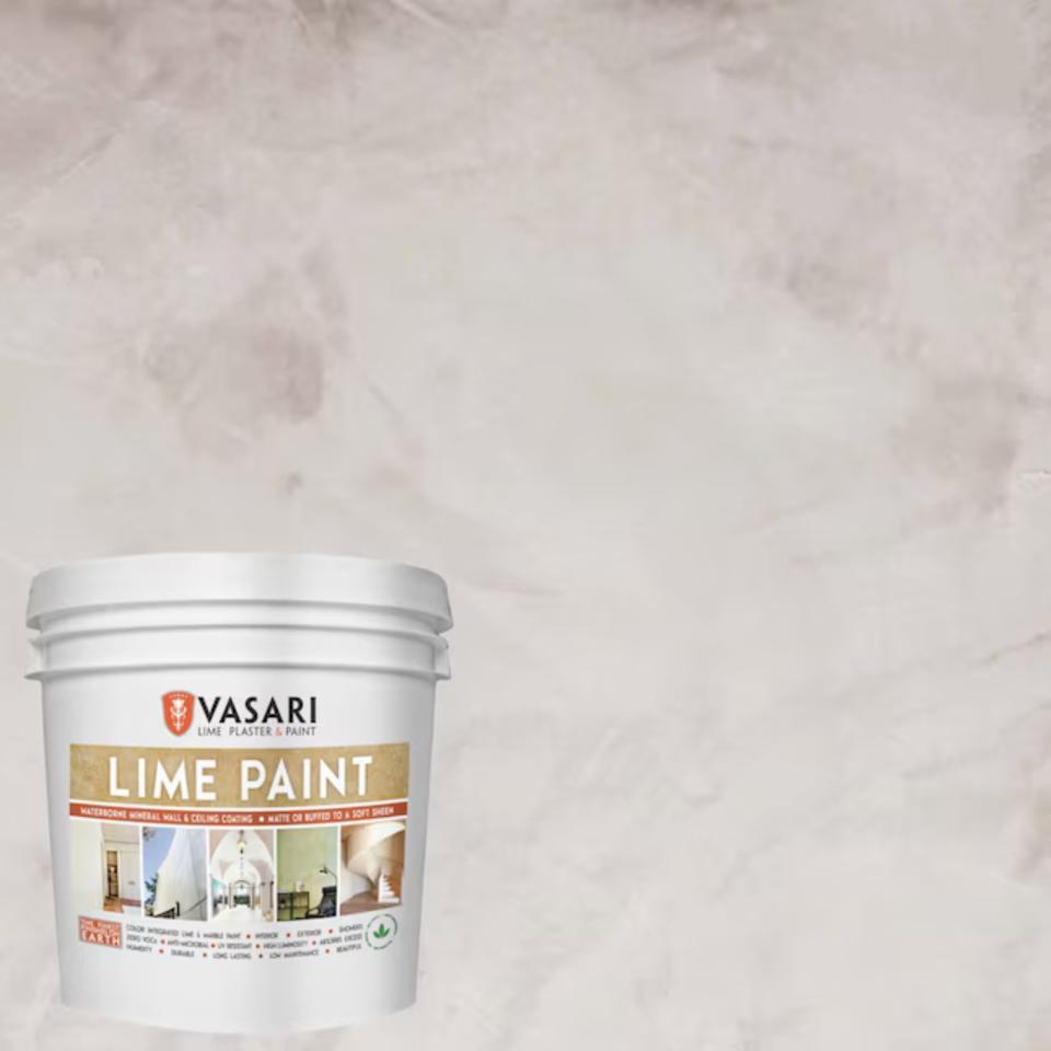

Vasari Flat Warm Slate Lime Interior Paint
Price: $67.50/gallon
Was: $74.98
2. USE PAINT TO HIGHLIGHT ARCHITECTURAL FEATURES
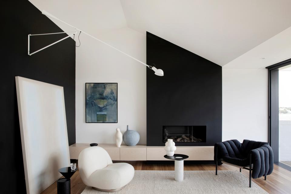

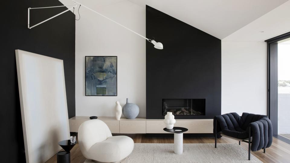
In the scheme above, Australian-based design firm Studio Prineas cleverly used black paint to highlight the sloping roof of their minimalist living space. A feature that many might consider hiding has been celebrated for its angular impression.
The sharp lines created by the minimalist paint idea give this interior a crisp and elegant expression. Furthermore, by painting the larger wall black to match, a sense of rhythm emerges in the space, it feels balanced and not random in design.
‘Our approach to the color palette was focused on creating a graphic silhouette that would accentuate the dramatic raked ceiling plane within the home,’ explains principal designer Eva-Marie Prineas. ‘Black paint has been applied to the living room fireplace, elevating it into a monolithic singular element.’
3. CHOOSE PAINT OVER UPHOLSTRY
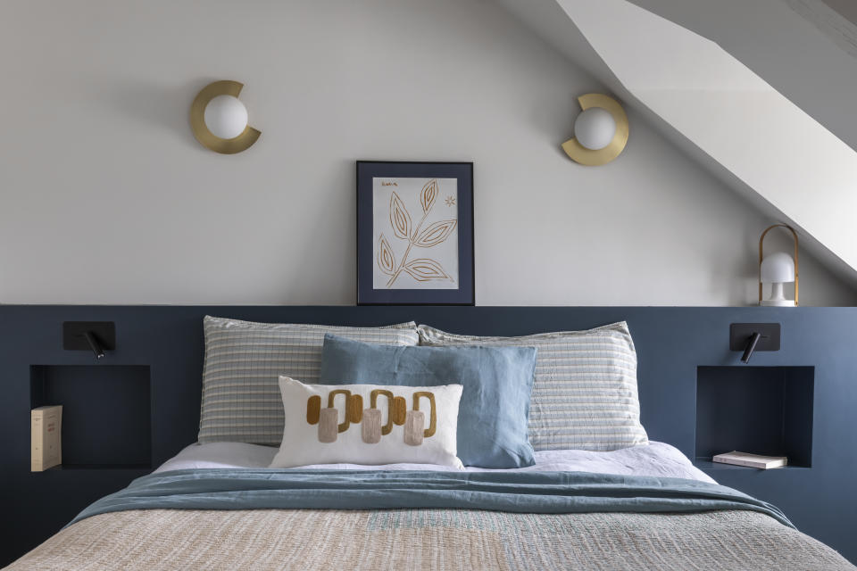

In her Parisian apartment bedroom, French architect and interior designer Camille Hermand demonstrates another impactful and minimalist paint idea, opting for a painted headboard in Aegean blue, contrasting the ivory walls and simultaneously making the bed feel even more inviting.
By doing so, she reminds us that sometimes choosing paint over upholstery can help keep even comforting spaces feeling more minimal. You also benefit from enjoying that much more color in your scheme.
‘Incorporating two colors in a room as part of a minimalist trend is not just about reducing complexity but also about creating an intentional and serene environment,’ Camille Hermand explains. ‘This approach emphasizes the beauty of simplicity and the power of thoughtful design.’


‘Aegean Teal’ 2136-40
Price: $55.99/ gallon
4. ELEVATE YOUR WALLS WITH ROMAN CLAY WASH
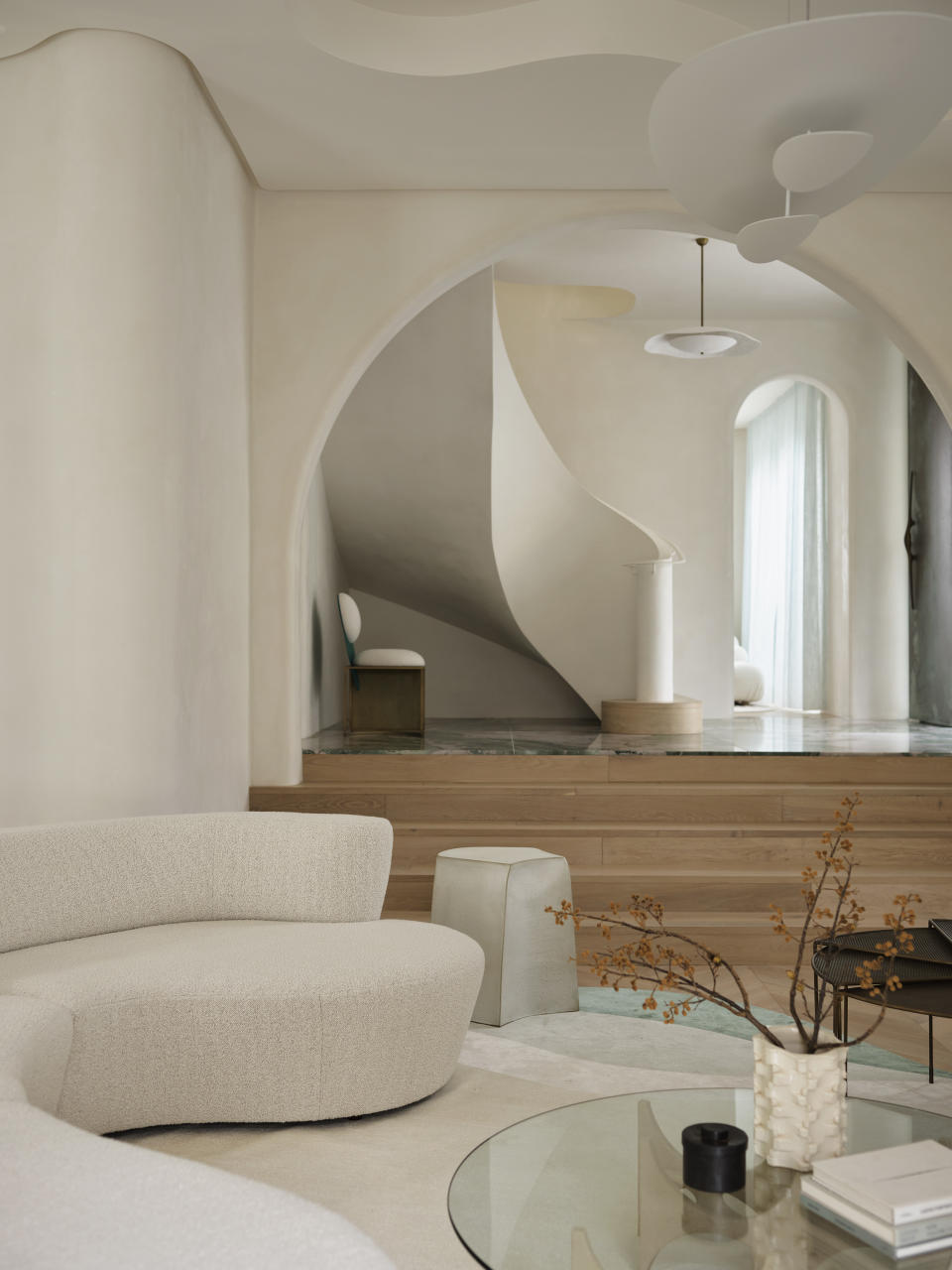

The smooth and textured surfaces of this home may have us all seeking out Roman clay painted walls very soon. ‘For my clients who love the clean, minimal look of white walls, I often suggest experimenting with different types of paint finishes to bring in a point of visual difference,’ explains Australian interior designer Greg Natale, who credits Cycladic architecture — ‘particularly all the powdery white curved buildings’ — as the inspiration.
‘We built white curves throughout the interior to enhance the flow of the home and finished the walls and ceilings in a clay-wash for some subtle texture. I’m calling this look European Minimalism,’ he adds.
It’s worth discerning that Roman clay and limewash walls are different. While clay walls deliver texture and a more stone like finish, lime-washed walls offer a more patinaed appearance. The application also varies as clay wash is applied with a spatula and will definitely require an expert, whereas limewash is applied with a brush or a roller.
5. MAKE A MINIMAL STATEMENT WITH COLOR DRENCHING
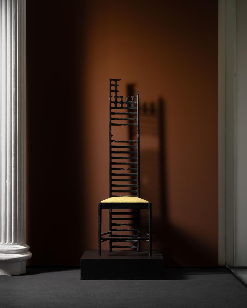

Minimalism in interior design is rooted in eschewing excess in favor of simplicity. Color drenching adopts a similar approach, by letting just one color be the star. Whether you opt for a dense rich hue like terracotta or a lighter fresh option like ecru, you are sure to give your walls an added strength of resolve. In turn, letting your furnishings shine.
‘It’s been stated for ages, but paint is one of the cheapest and easiest ways to dramatically transform one’s space…and there’s no need to hire a professional, you can even do it yourself,’ says Price Latimer, co-Founder of Alkemis Paint. ‘We recommend going for a pop of color with an accent wall or if you want a more fully enveloped environment, color drenching with any of Alkemis Paint’s all-natural, non-toxic, zero-VOC interior mineral paints (made from rock instead of plastic!) is always a grand idea.’
6. DON’T FORGET ABOUT THE DETAILS
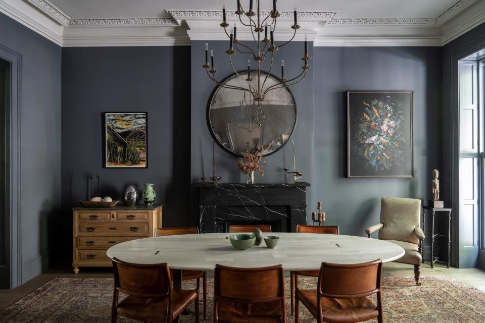

The lines between minimalism and maximalism in interior design have blurred quite a bit since their beginnings. If you want to utilize a minimal approach to paint, you don’t have to remove every period feature or detail in your home. Instead it’s worth thinking about how you can create contrast and highlight these details.
This is a sentiment that is echoed by color experts and producers of fine paint, Farrow & Ball. This modern dining space experiments with traditional and contemporary elements and the crisp white moldings and stone blue walls play a key part in that exchange.
‘Keep your color palette restricted, so as not to draw the eye to color changes,’ says Patrick O’Donnell, a brand ambassador for Farrow & Ball. ‘If your room has many architectural details, such as decorative crown moldings or wall paneling, use color drenching to minimize but not drown out the impact of the rooms’ architectural detail. One color all over (even on baseboards and built-in cabinetry) will keep things simple.’
7. LET THE LIGHT IN WITH REFLECTIVE HUES
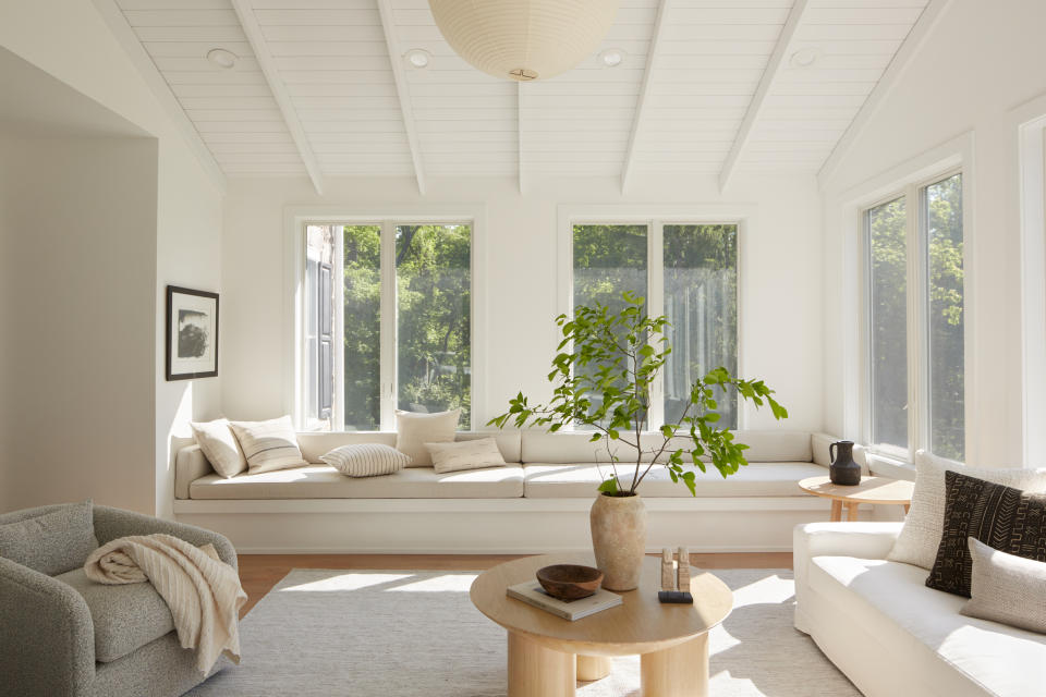

Part of what we praise minimalists’ spaces for so often is the expanse of light and space they offer their inhabitants. This inviting and airy living room designed by Philadelphia-based interior design collective Far Studio showcases the enduring appeal of minimalism. The use of light and reflective hues like white, ecru or sand keep the scheme feeling cohesive, but they also work well to create that sense of space.
‘We love to color drench when painting — meaning painting ceilings and walls the same color — it creates a beautiful cohesiveness and feels calm. Then we lean into the neutral tones with our fabrics, woods and natural materials,’ says interior designer Brittany Hakimfar, founder of Far Studio. Her work also shows us that color drenching doesn’t always have to be with dark hues, lighter and reflective shades harness its benefits too.
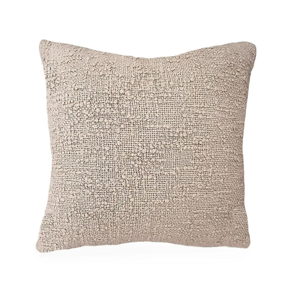

Anaya Cozzy Cotton Boucle Down Dutch Pillow
Price: from $70
Sizes: 14” x 20”, 20” x 20”, 26” x 26”
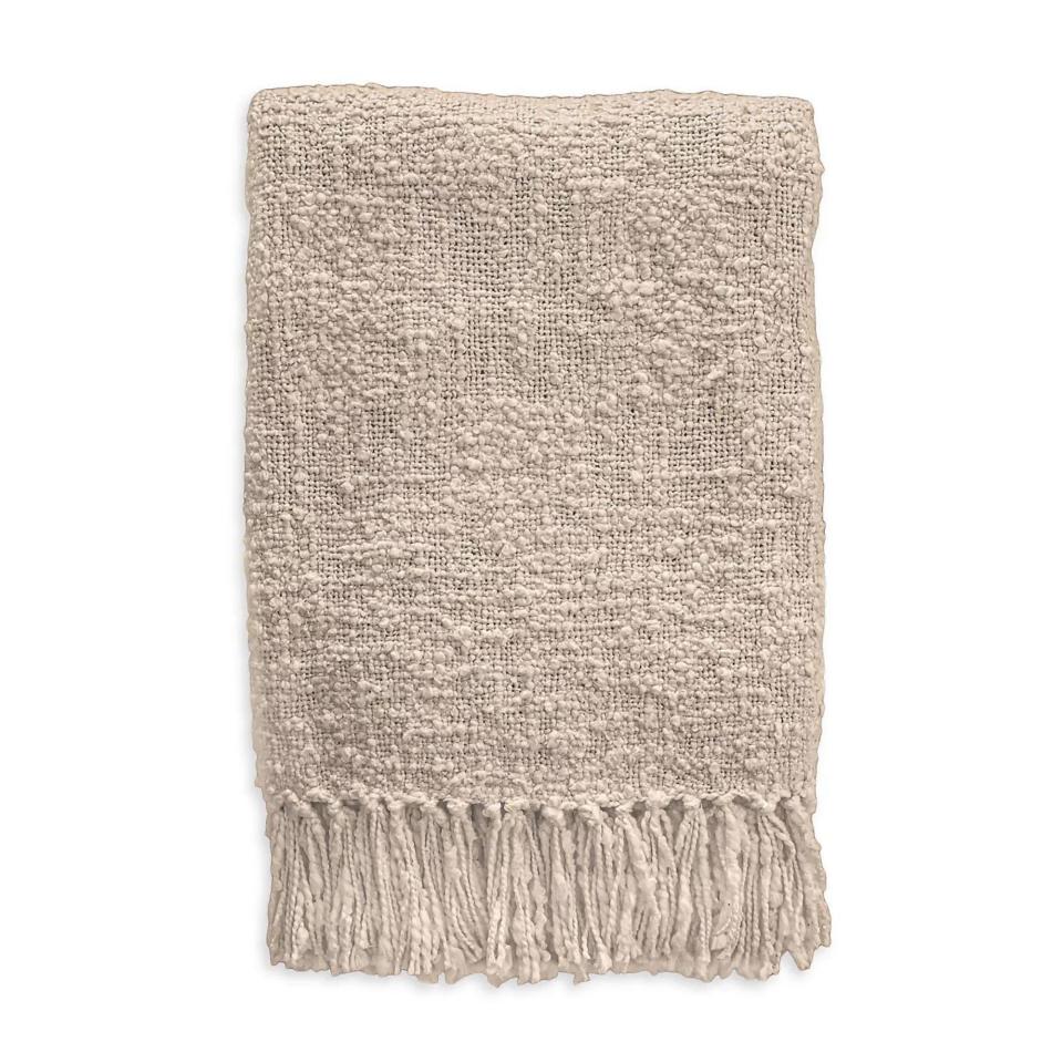

Anaya Cozzy Cotton Boucle Fringe Throw
Price: $95
Size: 50″ x 70″
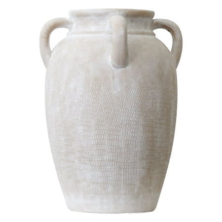

MainstaysWhite Washed Textured Ceramic Vase
Price: $29.88
Size: 12”
8. CREATE CONTRAST WITH PAINTED DOOR FRAMES
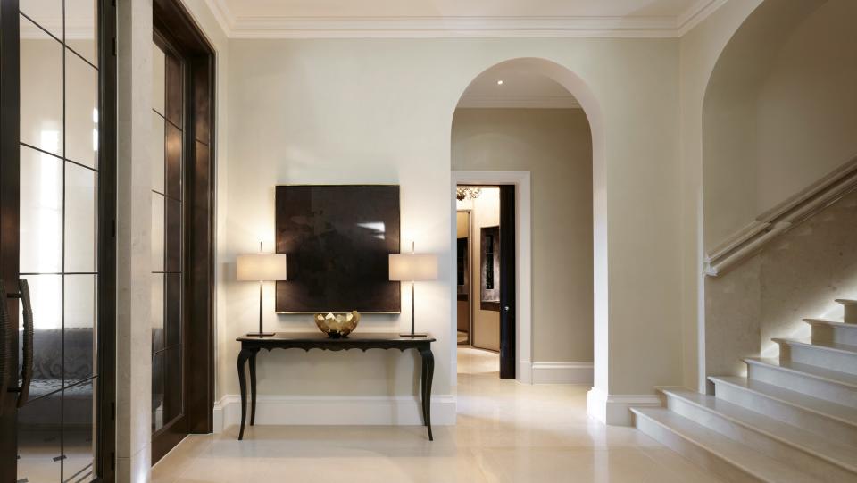

Award-winning British interior designer Louise Bradley understands the way color can help zone out spaces and create moments within the home. In this project’s entryway, the trim color combination includes door frames painted a dark jet black, contrasting with the cream walls and flooring. Not only can we appreciate the beautiful joinery as a result, but her clients are also able to clearly mark one space and atmosphere from the next.
‘A clever way to use minimalist paint is by using colors that either contrast or seamlessly blend with the rest of the room,’ she explains. ‘For example, when choosing a ceiling and/or paneling color, use a darker hue of the same paint shade to make a room look smaller and chicer. When trying to elongate a room, try using a slightly lighter shade on the ceiling.’


