We may earn revenue from the products available on this page and participate in affiliate programs.
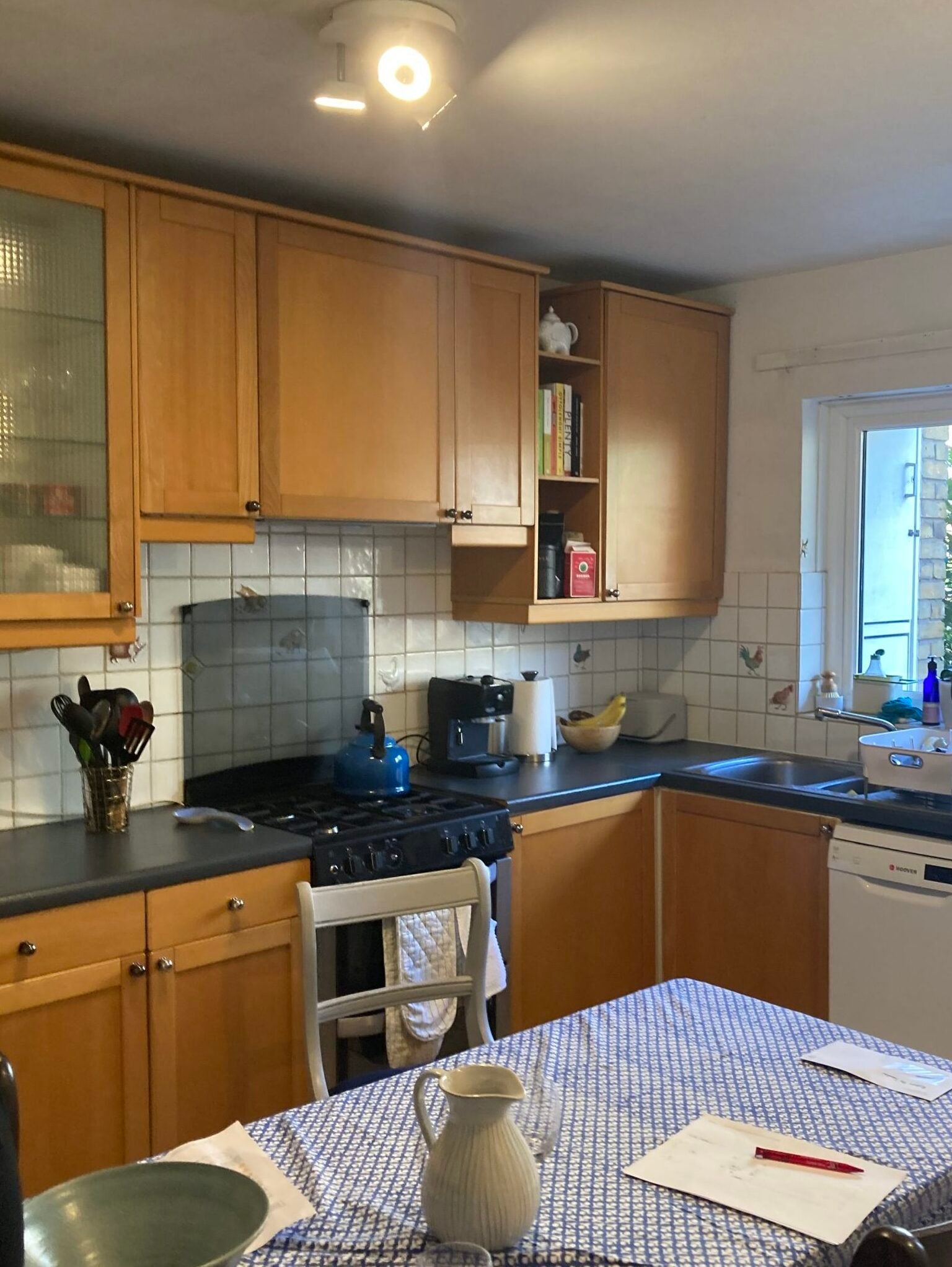
There’s no denying that cornices, fireplaces, and wall moldings all add charm and a sense of history to a home. But in contemporary properties lacking original features, a renovation provides an opportunity to create them from scratch. So that’s exactly what Celine Erlam, director of interior design practice Indie & Co., and her associates, Lea Berkhman and Sophie Walker, set about doing when they were asked to remodel this South London home for a couple welcoming their first child.
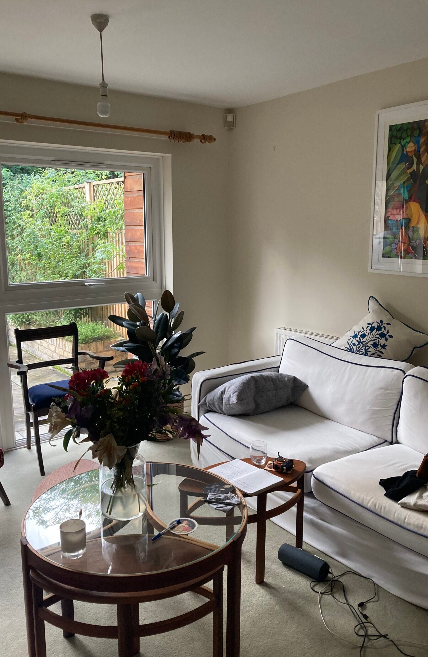
Built in the 1970s in a simple, modernist style, the house hadn’t been touched for decades. Plain and uninspiring, and with an abundance of awkward storage (the cupboard in the main bedroom couldn’t be fully accessed), it was calling out for an injection of character. The owners love the mid-century aesthetic and brought several key pieces with them, such as the principal bedroom’s bedside tables and chest of drawers, “so we kept the lines very clean and streamlined, and nodded to the era throughout,” says Berkhman. Here, the trio explains how they added spirited touches to turn an unloved space into a playful family home.
Embrace a Retro Color Theme
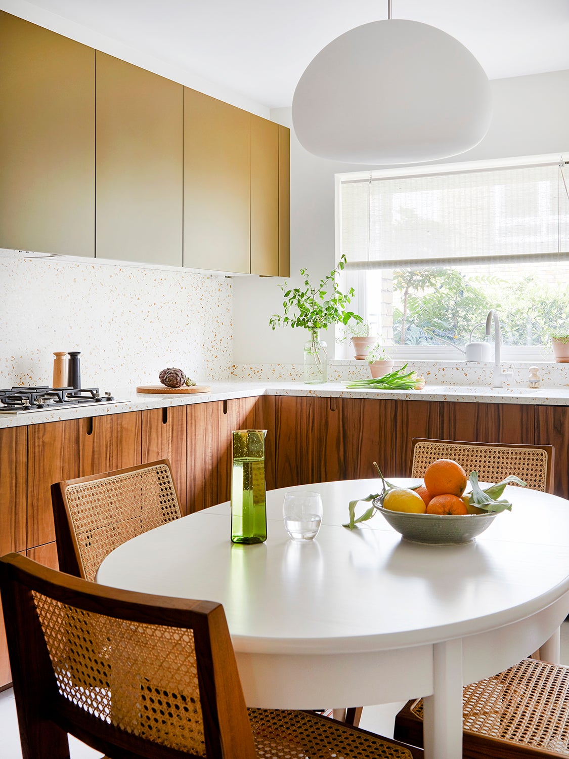
The warm palette of oranges, buttery yellows, and mossy greens chosen by Erlam and her team nods to the property’s construction date. Even the most neutral shade (in the hallway) is a pastel version of a classic white. “It’s 1970 reimagined for modern times,” explains Berkhman, who knew right from the start that she wanted to use Light Bronze Green by Little Greene in the kitchen. However, the clients, who were easygoing about most decisions, pushed back, as the room faces north and they wanted to ensure it remained as luminous as possible. “Instead of putting it on the walls, we used it on the top cabinets, so I still got it in there,” she says, laughing.
Have Fun With Millwork
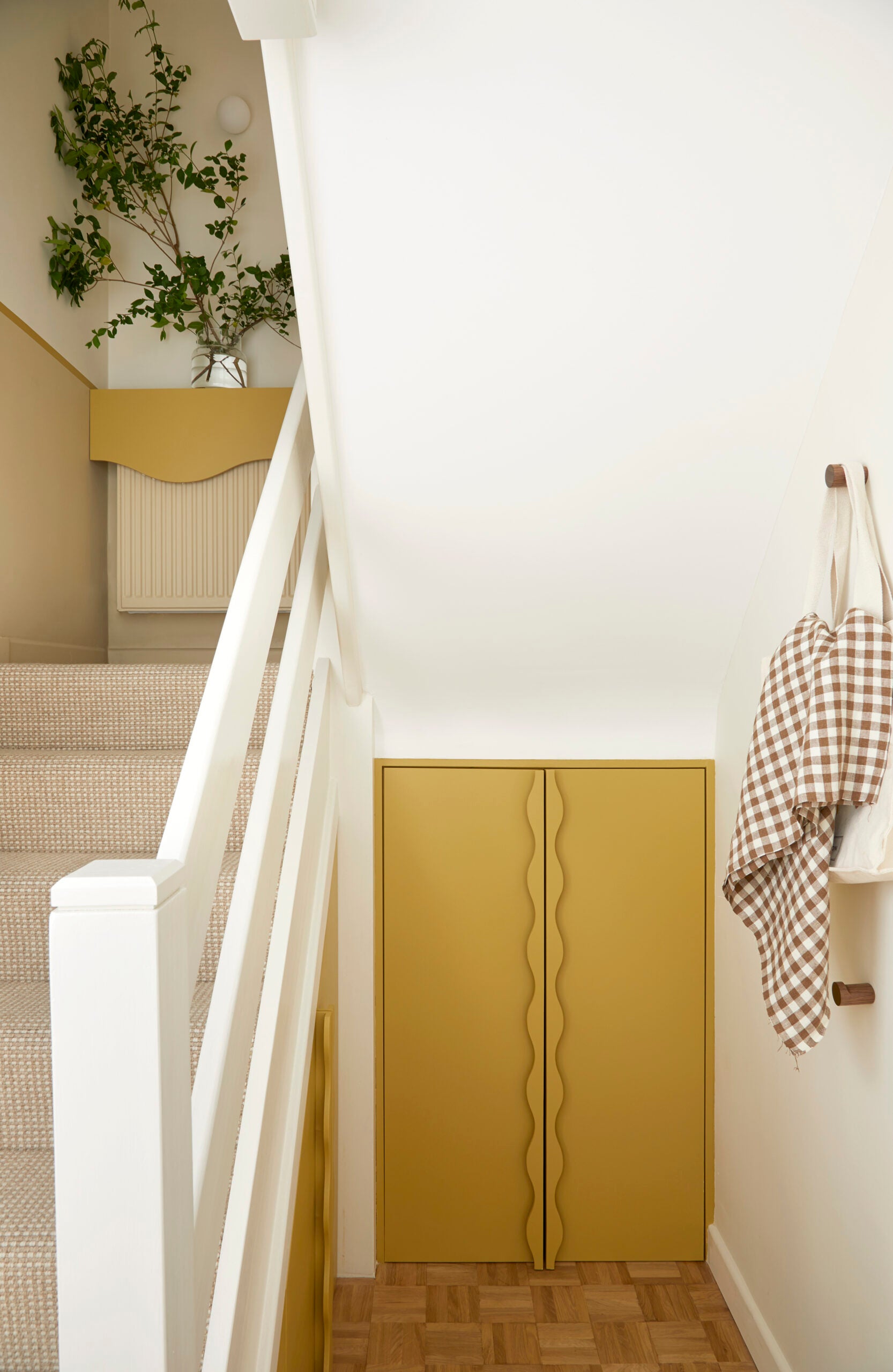
With a little imagination, the designers and their open-minded millworker gave the no-frills stairwell a characterful boost with some MDF. Wavy handles elevate the otherwise unremarkable storage cupboard, but Erlam knows out-there decisions often come down to timing. “We’d worked with the clients for a while [at this point], so they trusted our vision and were ready to take the leap,” she says. The asymmetrical radiator cover was born out of budget: “We often do treatments on radiators when there isn’t scope to replace them,” she explains. It was Walker who came up with the wavy line to echo the new arch leading to the living room, which not only disguises it but provides a surface on which to place something decorative.
Drop the Preconceptions of Parquet Flooring
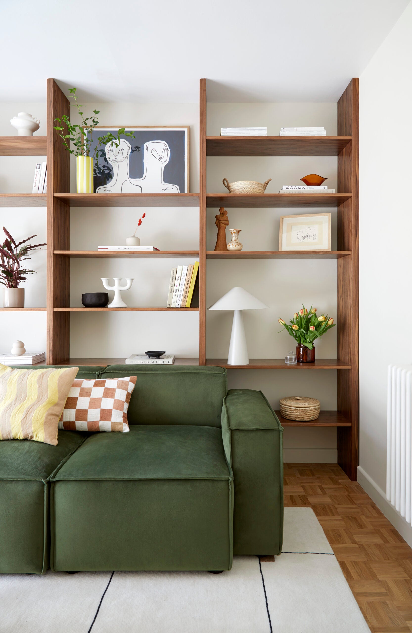
Upon peeling back the ugly carpets, the designers and owners held their breath, hoping that swaths of original wood floors would be revealed. Disappointingly, it wasn’t the case (all they found was subflooring), but an old-school, finger-block parquet style felt like a must-have for the house, so they redid everything.
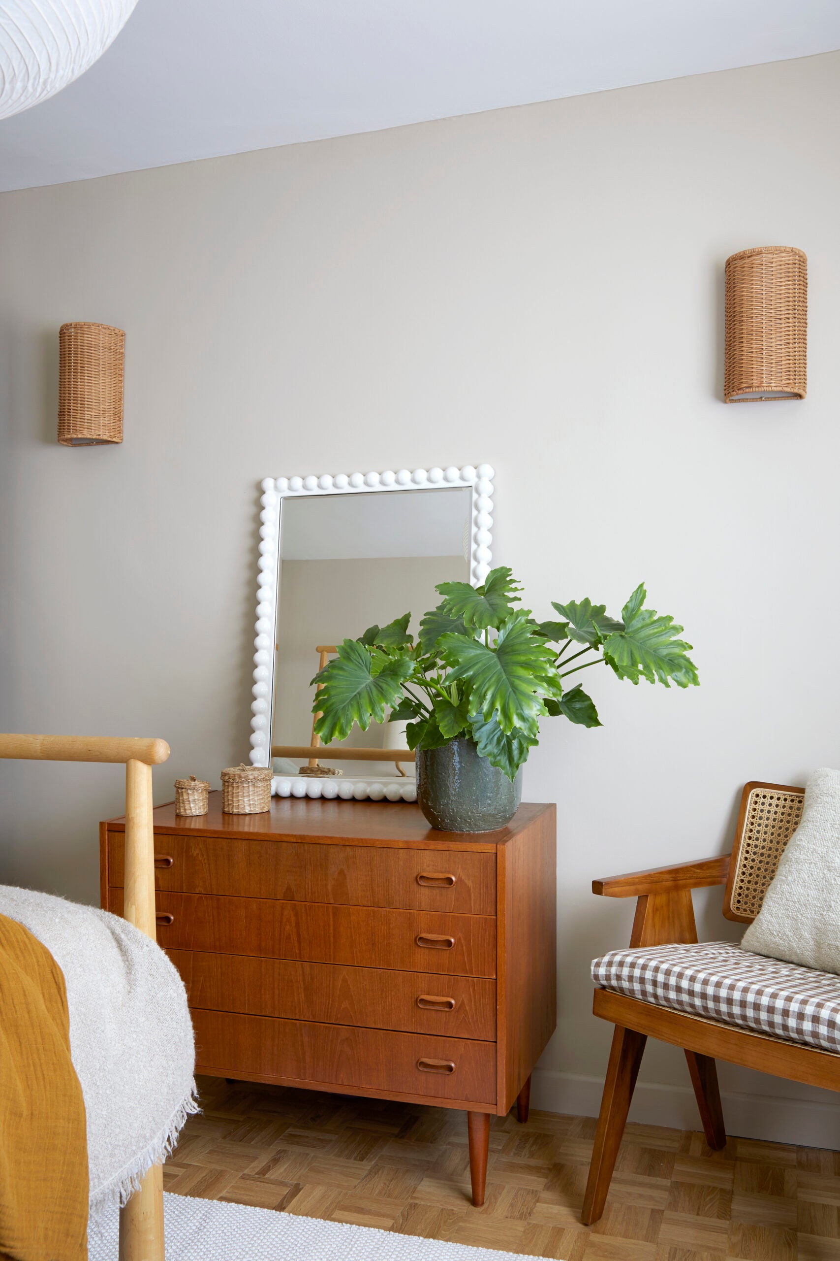
“It fits with the era perfectly while creating interest and character,” says Erlam. Deemed dated by some, the scale was just right: “The rooms aren’t big, so going for something larger would have felt odd,” she justifies.
Create Some Drama in the Bathroom


Because the bathroom was devoid of natural light, the team decided to get playful with color and form. Moving the tub to where the toilet used to live provided the opportunity to enclose it with another arch. “It’s quite theatrical, and with the curtain, it’s like a stage. Yet when you’re showering, you feel cocooned,” says Berkhman of her idea.
The yellow tile was inspired by a picture of a hotel in Marseille, France, depicting retro mustard-striped sun loungers. But there was no question of using it everywhere. “It would have been too much, so we found something more neutral for the walls,” explains Berkhman of the peachy vertical tile that serves as a complement.
Repeat to Cheat

It’s an all-too-familiar-sounding COVID-era story: During the renovation, the price of materials rose dramatically (the cost of the parquet increased 52 percent between the quote and installation), so the designers made a few clever cutbacks. For starters, they saved the remainder of the terrazzo slab from the kitchen worktops and used it in the bathroom. “There wasn’t much in the way of extra templating or installation costs, because the tradespeople were already coming for the kitchen,” explains Walker. The kitchen cabinets were a hack themselves: A local millworker created walnut fronts with unique notch handles to work with IKEA frames—though you’d never know from looking at them.


:max_bytes(150000):strip_icc()/GreenBlue84byFarrowBall-6774d582ab9748c29fad4b4b902b8317copy-350e14d3e2b8488e951ac03dfd76ca0f.jpg)


